Real IELTS Examiner Techniques | Practical Structures | Personal Feedback
IELTS PIE Charts
Pie Charts in IELTS Academic Writing Task 1
Understanding Pie Charts
Pie charts are a common visual representation in IELTS Academic Writing Task 1.
They display data as slices of a circle, with each slice representing a proportion of the whole, typically illustrating percentages.
Describing pie charts accurately and coherently is essential for achieving a high band score.
This guide provides a detailed approach to pie charts, including strategies, structure, and vocabulary, based on a real example.

Understanding the Task Requirements
-
Word Count: Write at least 150 words. While there is no strict upper limit, writing more than 180 words may risk including unnecessary detail or losing focus.
-
Time: Allocate around 20 minutes.
-
Focus Areas: Address Task Achievement, Coherence and Cohesion, Lexical Resource, and Grammatical Range and Accuracy.
-
Overview: Highlight the key features or notable patterns succinctly.
Step 1: Analyse the Chart
Spend a few minutes understanding the pie chart before writing:
-
Categories:
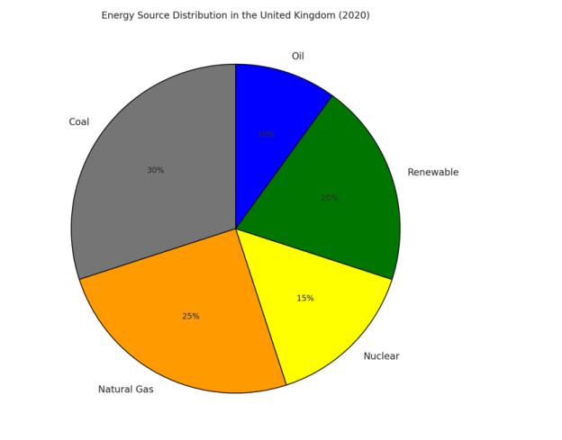
The chart shows five categories of energy sources: coal, natural gas, nuclear, renewable energy, and oil. -
Proportions:
Coal (30%) and natural gas (25%) make up the largest shares, while oil (10%) is the smallest. -
Comparisons:
Coal contributes roughly one-third of the energy, whereas oil provides just one-tenth. Renewable and nuclear energy occupy intermediate positions. -
Trends:
Only a single year (2020) is shown, so focus on proportional comparisons rather than changes over time.
Step 2: Paraphrase the Task
Begin your essay with a rephrased version of the task description.
-
Task Statement:
The pie chart shows the distribution of energy sources in the United Kingdom in 2020. -
Paraphrased Version:
The pie chart illustrates the proportion of different energy sources contributing to the United Kingdom’s total energy supply in 2020.
Step 3: Write an Overview
Summarise the main trends without listing detailed figures.
Overview:
Overall, fossil fuels dominated the UK’s energy supply in 2020, with coal and natural gas making up the largest shares. Renewable energy and nuclear power provided smaller but significant contributions, while oil accounted for the smallest proportion.
Step 4: Detailed Analysis
Organise your main analysis into two focused paragraphs:
-
Paragraph 1:
Coal was the leading source of energy, representing 30% of the total, which is approximately one-third of all energy production. Natural gas followed closely, comprising one-quarter of the total at 25%. Combined, coal and natural gas accounted for more than half of the UK’s energy supply, clearly highlighting the country’s reliance on fossil fuels. Renewable energy ranked third, contributing 20%, which was notably higher than nuclear energy. -
Paragraph 2:
Nuclear power made up 15% of the overall distribution, equivalent to about one-sixth of the energy supply. Oil was the least significant source, responsible for only 10% of the total, which is one-third of the contribution made by coal. Together, nuclear and oil accounted for just a quarter of the total energy mix, further underscoring the dominance of fossil fuels in the UK’s 2020 energy landscape.
Step 5: Review and Edit
After writing, check for:
-
Grammar and Spelling Errors: Ensure there are no grammatical mistakes or spelling issues.
-
Consistency in Tenses: Use the past tense when describing completed data.
-
Data Accuracy: Double-check that all figures match the information presented in the chart.
Vocabulary for Describing Pie Charts
Describing Proportions:
-
Large Proportions: a significant majority, the largest segment, a substantial portion
-
Moderate Proportions: a considerable part, a notable percentage
-
Small Proportions: a minor segment, the smallest slice, an insignificant fraction
Useful Phrases:
-
“Coal accounted for 30% of the total.”
-
“Natural gas comprised one-quarter of the energy supply.”
-
“Oil represented the smallest proportion.”
-
“Renewable energy was a notable contributor.”
Common Pitfalls
-
Misinterpreting Data: Always ensure figures are accurately matched to the chart.
-
Omitting the Overview: Always summarise the key features clearly.
-
Excessive Detail: Focus on major trends, not every category equally.
-
Inconsistent Tenses: Use the past tense to describe completed historical data.
